
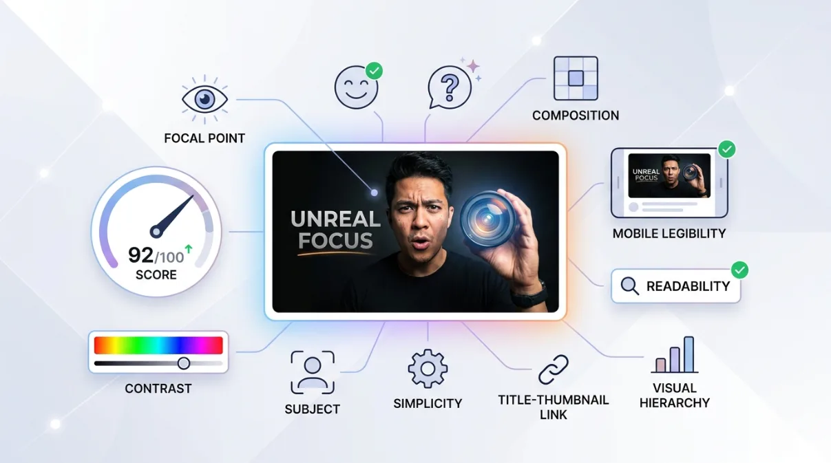
A good YouTube thumbnail does two jobs with its title: it earns the click, and it makes a promise the video can keep. ThumbSignal scores that pair on twelve factors. Eight decide whether the impression becomes a click, three decide whether the click turns into a viewer who stays, and one, clickbait risk, counts against the whole score. Below is what each factor means, one example of it done well and badly, and the article that teaches it.
Key takeaways
- The twelve factors are thumbnail readability, title strength, curiosity, cliffhanger, withheld answer, FOMO, urgency, rarity, promise clarity, coherence, emotion and clickbait risk. They are the factors the ThumbSignal guide describes and the analyzer scores.
- They sit in two layers: will the impression earn a click, and is the promise clear enough to keep the viewer. The global score is not an average of the twelve: a package has to succeed at both layers, and one weak layer drags the whole result down.
- Readability and title strength are the floor. A thumbnail that cannot be read at feed size gives the other factors nothing to work with.
- Several of the psychological factors overlap. In the 642 thumbnails and titles we scored for our test of the score, curiosity, cliffhanger, withheld answer and FOMO correlated with one another between 0.73 and 0.88: mostly one quality, "how much the packaging leaves open".
- Clickbait risk is the one to keep low. Raising a hook beyond what the video delivers lowers the whole score, not one factor.
What makes a good YouTube thumbnail?
A good YouTube thumbnail is readable at the size viewers meet it, works with its title rather than repeating it, leaves one honest question open, and promises only what the video gives. Those four ideas cover the twelve factors below. The first job is the click: everything a viewer sees in the feed before choosing. The second is what happens after it: a viewer who cannot tell what they are going to get is more likely to leave early, and YouTube says its recommendations weigh viewer satisfaction, not clicks alone.
The click layer: will the impression earn a click?
Eight factors read what is visible before the click. Title strength carries the most weight in this layer, because the title is the hook a creator can rewrite most directly.
1. Thumbnail readability
Can the text, the subject and the contrast be read on a phone, at feed size? Readability covers text visibility, contrast, clutter and how clear the subject is. Read why readability is table stakes, then the fixes for contrast and colour, one focal point, where text gets cut and how many words.
- Good: one face and two bold words, with a dark outline, that still read when the thumbnail is shrunk to a phone feed.
- Bad: five small elements and a sentence in a thin font, which turn into a blur on a phone.
2. Title strength
Does the title say something specific, in plain words, for the audience it is meant for? Title strength reads length, promise, precision, filler words and audience fit. Read the title formulas that work and when each one fails, and our title rules tested against real clicks.
- Good: "I Cut My Editing Time in Half With One Setting", a concrete result for a named audience.
- Bad: "Editing Tips and Tricks You Need to Know in 2026", which promises nothing a viewer can picture.
3. Curiosity
Does the package open a question the video answers? On thousands of randomized headline tests, clicks peaked at a middle level of concreteness: too vague lost, and too specific lost too. Read how to use the curiosity gap without misleading viewers.
- Good: the result is named and the method held back: "The Cheap Mic That Beat My $400 One".
- Bad: "You Won't Believe What Happened", which hides everything, including whether the video is for you.
4. Cliffhanger
Is there unresolved tension, a moment cut before it ends? It is the narrative form of curiosity and has no study of its own. Read how to use the cliffhanger effect.
- Good: the frame just before the outcome of an experiment, with the outcome in the video.
- Bad: a staged moment that never happens in the video.
5. Withheld answer
Does the title or image point to an answer, a method or a result, and hold it back? This factor was called Zeigarnik until 4 October 2026. We renamed it because the memory effect that name claims does not replicate; see what the evidence says about Zeigarnik, FOMO and urgency.
- Good: "The One Setting Every Beginner Gets Wrong", where the setting is named in the video.
- Bad: three open questions at once, which make the promise vaguer, not stronger.
6. FOMO
Is there social proof, a sign that others already benefit? Fear of missing out has been studied as a trait of social-media users; we found no study of it as a property of a title that changes clicks. Read how FOMO is used in thumbnails, and its limits.
- Good: "The Method 3 of Our Readers Used to Pass", when those readers exist and appear in the video.
- Bad: "Everyone Is Doing This", with no one in the video.
7. Urgency
Is there a time limit, a now-or-never framing? Scarcity and urgency messages raise purchase intention under a real limit; a free video has no real limit, and the transfer to clicks is unproven. Read what the research says on urgency.
- Good: "Before the Price Change on 1 March", when the change is real and dated.
- Bad: "Watch Before It's Deleted" on a video that is not going anywhere.
8. Rarity
Does the package signal something exclusive or hard to get? Rarity is a claim the video has to back: access no one else had, data no one else has shown. Read what the research says on scarcity and rarity.
- Good: "Inside the Factory Where Our Guitar Strings Are Made", when the video was filmed there.
- Bad: "The Secret They Don't Want You to Know" on common advice.
The satisfaction layer: is the promise clear enough to keep the viewer?
Three factors read the packaging's share of what happens after the click. Promise clarity dominates this layer. The analysis reads the title and the thumbnail, never the video, so it cannot tell whether the video keeps the promise; it can tell whether the promise is clear.
9. Promise clarity
Does the viewer understand at once what they will get? In our test of the score, the clarity of the promise separated a channel's better videos from its weaker ones more than any of the psychological triggers did. Read how to avoid over-promising, click satisfaction and how to fix an expectation mismatch.
- Good: "How I Fixed My Slow PC in 10 Minutes, Without Buying Anything".
- Bad: "This Changed Everything", which could be any video.
10. Coherence
Do the image and the title complement each other, rather than repeat or contradict each other? Read should thumbnails repeat titles and title or thumbnail: which matters more.
- Good: the title names the result, the thumbnail shows the before and after.
- Bad: the thumbnail repeats the title word for word, or shows a scene that is not in the video.
11. Emotion
Do the facial expression, the colour energy and the tone fit the content? On real headline tests, negative words raised clicks slightly; in our own test, emotion barely separated a channel's better videos from its weaker ones. Read which emotions earn the click and whether faces improve thumbnails.
- Good: a calm, focused face on a calm tutorial.
- Bad: a screaming face on a video that never raises its voice.
The penalty: clickbait risk
12. Clickbait risk
Does the package promise more than a video like this can deliver? Clickbait risk is the one factor where higher is worse, and it is not averaged in: it is a penalty applied to the combined score. Mild hyperbole barely registers; severe overpromising is heavily punished. YouTube's policies prohibit thumbnails that maliciously mislead viewers into clicking. Read clickbait versus curiosity and how to raise CTR without clickbait.
- Good: a strong hook that the first minute of the video pays off.
- Bad: "I Almost Died" on a video about a missed train.
Before any factor: the technical floor
None of the twelve factors is about file size or resolution, but a thumbnail that is blurry or refused at upload never gets read. YouTube recommends 3840x2160 pixels at 16:9, at least 640 pixels wide; Shorts use 2160x3840 at 9:16. Use JPG or PNG. The size limit depends on where you upload: 50 MB from a computer, 2 MB from the mobile app.
How to use the twelve factors without overdoing it
- Fix readability first. Shrink the thumbnail to phone-feed size: if the text or the subject stops reading, nothing else matters yet.
- Make the title say one concrete thing, and let the thumbnail show what the title does not say.
- Leave one question open, not three. Curiosity, cliffhanger and the withheld answer are mostly the same lever.
- Use urgency, FOMO and rarity only when they are true of the video.
- Check that the promise is still clear, and that the hook did not raise clickbait risk.
- Score your thumbnail and title on the twelve factors, change one thing, and score it again to see which factor moved.
Limits of these factors
The factors describe the packaging, not the video. A score is a reading of how the title and thumbnail present a video, made by a model, and it can change slightly between two runs on the same pair. It is not a forecast of your click-through rate: on 321 pairs of videos from the same channel, the score picked the better performer 59.5% of the time, better than a coin flip and far from certain (how the score was tested). Several factors overlap, and some psychological ones rest on thin evidence for clicks; we say so in each article. What a thumbnail earns on your channel is settled by your viewers, for example with YouTube Studio's Test & Compare where your channel has it.
Correction, 19 October 2026. Earlier versions of this article listed twelve factors of their own, among them branding, aspect ratio, file format and identity, and said that ThumbSignal's scored factors only overlapped with that list. The article now presents the twelve factors ThumbSignal actually scores, as the guide describes them, and links each one to the article that teaches it. The size and format advice is kept, as a technical floor outside the factors.
Correction, 17 October 2026. An earlier version gave 1280x720 as a required size and 2 MB as the limit everywhere, said YouTube does not support GIF, suggested testing at 150x80 pixels and used "SHOCKING RESULT" as a good example. These have been corrected against YouTube's help pages.
Sources
- YouTube Help. Add custom thumbnails on YouTube. support.google.com/youtube/answer/72431
- Goodrow, C. (2021). On YouTube's recommendation system. YouTube Official Blog. blog.youtube
- YouTube Help. Spam, deceptive practices and scams policies. support.google.com/youtube/answer/2801973
- Aubin Le Quéré, M. and Matias, J. N. (2025). When curiosity gaps backfire: effects of headline concreteness on information selection decisions. Scientific Reports, 15, 994. doi:10.1038/s41598-024-81575-9
- Bakhshi, S., Shamma, D. A. and Gilbert, E. (2014). Faces engage us: Photos with faces attract more likes and comments on Instagram. Proceedings of CHI 2014, 965–974. doi:10.1145/2556288.2557403
Frequently Asked Questions
What are the 12 factors of a good YouTube thumbnail?
Thumbnail readability, title strength, curiosity, cliffhanger, withheld answer, FOMO, urgency and rarity decide the click; promise clarity, coherence and emotion decide whether the viewer stays; clickbait risk counts against the whole. They are scored on the thumbnail and the title together, because a viewer meets them together.
What is the most important factor in a YouTube thumbnail?
No single factor decides clicks. Start with readability, because a thumbnail that cannot be read at feed size gives the other factors nothing to work with. Then check promise clarity: in our test, it separated a channel's better videos from its weaker ones more than any of the psychological triggers.
Is the thumbnail score an average of the 12 factors?
No. The click factors and the satisfaction factors form two layers that are combined so that one weak layer drags the result down, and clickbait risk is a penalty on the combined score. The guide explains how.
Do psychological triggers like FOMO and urgency work on YouTube?
The evidence for clicks is thin. We found no study of FOMO as a property of a title, and scarcity research is about buying, not clicking. Use them only when they are true of the video; a false deadline or a fake crowd raises clickbait risk.
How do I check my thumbnail against the 12 factors?
Score it with ThumbSignal's free analyzer: you get each factor's score, your weakest factors and what to change first. Then change one thing and score again. Once the video is live, YouTube Studio's Test & Compare, where your channel has it, lets real viewers decide.