Key takeaways
- There’s no universal magic number for thumbnail text — effectiveness depends on context, font, and device.
- Zero text can work for strong visuals, but risks being ignored if the image doesn’t convey the video’s value.
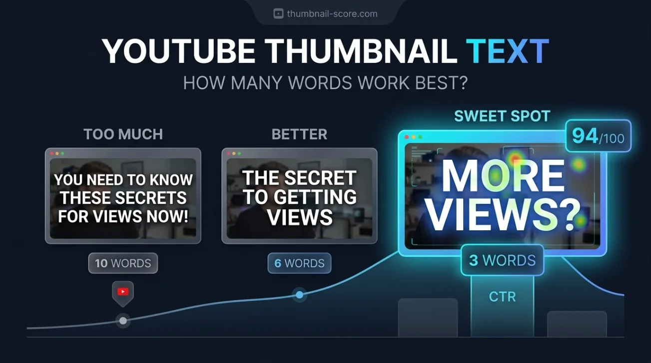
- Two to four words are ideal for mobile readability and quick comprehension without clutter.
- Text should add new information — never just repeat the video title or waste space with obvious phrases.
- Always preview thumbnails at mobile size and test contrast, font weight, and spacing for real-world legibility.
How many words should you actually use on a YouTube thumbnail?
There’s no single correct number of words for YouTube thumbnails — the right count depends on your visual design, target audience, and device context. Generally, two to four words work best for mobile readability and immediate comprehension, while zero or six-plus words can succeed only under specific conditions. The goal is clarity, not word count.
YouTube thumbnails appear in many contexts: desktop feeds, mobile feeds, suggested videos, and even as tiny icons in playlists. Each context shrinks the thumbnail’s visible area, making text harder to read. A thumbnail that looks bold and clear on a 27-inch monitor may become illegible on a 6-inch phone screen. That’s why testing at actual mobile scale isn’t optional — it’s essential.
Many creators default to “three words” because it’s a common recommendation — but that’s not a rule. A single powerful word like “FREE” or “SHOCKING” can outperform three generic ones. Conversely, a four-word phrase like “You’re Doing It Wrong” can deliver more context than “Mistake” alone. The real metric isn’t word count — it’s whether the viewer instantly understands the video’s value.
Zero text: When no words work better than any words
Thumbnails with zero text can perform exceptionally well if the visual alone conveys the video’s promise — think recognizable faces, strong emotions, or instantly readable symbols like dollar signs, clocks, or arrows. This approach works best for established channels with loyal audiences who recognize the creator’s style or branding.
For new channels or niche topics, zero-text thumbnails risk being skipped because viewers have no immediate cue about the video’s content. A face with a surprised expression might be intriguing, but without context, it’s ambiguous. If your thumbnail relies on visual storytelling alone, ensure the image contains a clear focal point, high contrast, and emotional or informational cues that don’t require text to decode.
Zero-text thumbnails also avoid the risk of text being cropped or illegible on smaller screens. They’re especially effective for reaction videos, vlogs, or channels where the creator’s face is the brand. But if your video’s value isn’t obvious from the image — for example, a tutorial on Excel formulas — adding even one word like “FORMULA” can dramatically improve click-through.
Two words: The sweet spot for mobile readability
Two words on a YouTube thumbnail strike the ideal balance between clarity and simplicity, especially on mobile devices where screen real estate is limited. Phrases like “FREE TOOL”, “BIG MISTAKE”, or “QUICK FIX” deliver immediate value without overwhelming the viewer. These combinations work because they pair a benefit (free, big, quick) with a noun (tool, mistake, fix) that signals the video’s topic.
Two-word thumbnails also leave room for strong visuals — you’re not forcing text to dominate the frame. This gives you flexibility to use expressive faces, bold colors, or symbolic imagery that complements the text rather than competes with it. The key is to choose words that are high-impact and low-ambiguity. Avoid vague terms like “Amazing” or “Cool” — they don’t tell the viewer what the video offers.
When using two words, prioritize font size and spacing. Even if the words are short, they must be large enough to read at thumbnail scale. Test your design by shrinking it to 120x70 pixels — if you can’t read the text without zooming, it’s too small. Use bold, sans-serif fonts with high contrast against the background to ensure legibility.
Four words: When you need to add context without clutter
Four words on a YouTube thumbnail can work if the phrase is tightly constructed and the font is optimized for small screens. Examples like “You’re Doing It Wrong” or “This Changed Everything” add narrative tension or personal stakes that two words can’t convey. These phrases create curiosity by implying a problem or transformation — which is exactly what drives clicks.
The challenge with four words is avoiding visual clutter. If the text takes up more than 30% of the thumbnail, it starts to feel like an ad rather than a preview. To prevent this, use tight kerning, limit line breaks, and avoid decorative fonts. Stick to one line of text if possible — two lines should be reserved for phrases that naturally break, like “I Tried This” on the first line and “And It Worked” on the second.
Four-word thumbnails also benefit from strategic placement. Put the text in the top or bottom third of the thumbnail, where it’s less likely to be cropped by YouTube’s UI or obscured by video duration labels. Always test the thumbnail at actual mobile size — what looks balanced on a large screen may become unreadable when scaled down.
Six or more words: When longer text can still succeed
Six or more words on a YouTube thumbnail can work — but only under specific conditions. These include using a very large, bold font; placing the text in a high-contrast area; and ensuring the phrase is broken into short, scannable lines. Phrases like “I Spent $1000 On This” or “Why This Trick Works” can deliver more context than shorter options, especially for tutorial or review content.
The risk with longer text is that it becomes illegible on mobile or gets cropped by YouTube’s UI. Even if the text is technically readable, it may feel overwhelming — viewers scan thumbnails in under a second, and too many words slow them down. If you must use six or more words, prioritize the first two or three as the most critical — the rest should be supporting context that can be skipped without losing the core message.
Longer text also increases the chance of repetition with the video title. If your thumbnail says “How to Fix Your Wi-Fi” and your title says the same thing, you’re wasting space. Instead, use the thumbnail to add a benefit or emotion — “Fix Your Wi-Fi FAST” — while letting the title handle the topic. This creates a complementary relationship between the two elements rather than redundancy.
When text adds value versus when it repeats the title
Thumbnail text should never simply repeat the video title — it should add a new layer of information that makes the viewer curious or excited. If your title is “How to Make a Perfect Omelette”, your thumbnail text could be “No Burn, No Mess” to highlight the benefit. This creates a synergy: the title tells the viewer what the video is about, and the thumbnail tells them why they should care.
Repeating the title in the thumbnail is redundant and wastes valuable visual real estate. Viewers see the title and thumbnail side by side — if both say the same thing, one of them is unnecessary. Instead, use the thumbnail to emphasize emotion, urgency, or exclusivity. Phrases like “You Won’t Believe This” or “Only 3 Steps” create a sense of discovery that the title alone can’t provide.
To test whether your text adds value, ask: “If I removed the thumbnail text, would the viewer still understand the video’s promise?” If the answer is yes, the text isn’t doing enough. If the answer is no, you’ve found the right balance. Always aim for the thumbnail to answer the question “Why should I click?” — not just “What is this?”
Mobile thumbnail design checklist for readability
Mobile devices account for the majority of YouTube views — so your thumbnail must be legible at small scale. Use this checklist to ensure your design works on phones:
- Preview your thumbnail at 120x70 pixels — if you can’t read the text without zooming, increase font size or reduce word count.
- Use high-contrast colors — white or yellow text on dark backgrounds, or black on light — to ensure readability in low-light conditions.
- Choose bold, sans-serif fonts — avoid script or decorative typefaces that become illegible when scaled down.
- Limit text to one or two lines — more than that increases the risk of cropping or visual clutter.
- Place text in the top or bottom third of the thumbnail — avoid the center, where YouTube’s duration label may obscure it.
- Test your thumbnail in a real YouTube feed — upload a test video and view it on a phone to see how it looks in context.
Mobile readability isn’t just about font size — it’s about hierarchy. The most important word should be the largest and most prominent. If your thumbnail says “FREE Download Now”, “FREE” should be the biggest word — it’s the primary hook. “Download Now” supports it but doesn’t need to compete for attention.
Also consider the context in which your thumbnail appears. In a feed full of bright, busy thumbnails, a clean, minimal design with bold text can stand out. Conversely, in a feed of plain thumbnails, a more detailed image with short text might grab attention. Always test your design against your competitors’ thumbnails — what works in one niche may not work in another.
How to test and refine your thumbnail text for maximum clicks
Testing your thumbnail text isn’t just about A/B testing — it’s about understanding what drives clicks in your specific niche. Start by creating three variations: one with zero text, one with two words, and one with four words. Upload them as test videos and track their performance over 48 hours. Pay attention to click-through rate (CTR), not just views — a high CTR means your thumbnail is compelling, even if the video doesn’t retain viewers.
Use ThumbSignal’s free thumbnail & title analysis tool to get instant feedback on readability, contrast, and emotional impact. The tool scores your thumbnail on 12 factors, including text legibility and mobile optimization, so you can see exactly where your design succeeds or fails. This isn’t guesswork — it’s data-driven refinement.
Also consider the emotional tone of your text. Words like “SHOCKING”, “SECRET”, or “EASY” trigger curiosity or urgency, which can boost clicks. But overuse can make your channel feel clickbaity — balance emotional hooks with genuine value. If your video delivers on the promise, viewers will return. If it doesn’t, they’ll unsubscribe.
Finally, don’t ignore the visual context. A thumbnail with bold text on a plain background may work for one video but fail for another. Match the text style to the video’s tone — playful fonts for comedy, clean sans-serifs for tutorials, bold caps for reviews. Consistency builds brand recognition, but flexibility ensures each thumbnail speaks to its specific audience.
Related reading
- What Top YouTube Thumbnails Have in Common: 100 Real Examples
- YouTube Title Optimization: Browse vs Search Strategies That Work
Frequently Asked Questions
Is there a maximum number of words for YouTube thumbnails?
No official limit exists, but practical constraints like mobile readability and visual clutter make six or more words risky. If you must use longer text, ensure it’s large, bold, and broken into scannable lines — and always test at actual thumbnail size.
Should I use the same text in my thumbnail and title?
No — thumbnail text should complement the title, not repeat it. Use the thumbnail to highlight a benefit, emotion, or curiosity gap, while the title handles the topic. This creates a stronger click signal than redundancy.
How do I know if my thumbnail text is readable on mobile?
Shrink your thumbnail to 120x70 pixels and view it on a phone screen. If you can’t read the text without zooming, increase font size or reduce word count. Also test it in a real YouTube feed to see how it looks alongside other thumbnails.
Can I use zero text on my thumbnail and still get clicks?
Yes, if your visual alone conveys the video’s value — think recognizable faces, strong emotions, or symbolic imagery. Zero-text thumbnails work best for established channels or videos where the image tells the story, like reaction videos or vlogs.
What font size should I use for YouTube thumbnail text?
There’s no fixed size — it depends on the thumbnail’s dimensions and word count. As a rule, text should occupy no more than 30% of the thumbnail and be legible at 120x70 pixels. Use bold, sans-serif fonts with high contrast for best results.
How do I test which thumbnail text performs best?
Create three variations — zero, two, and four words — and upload them as test videos. Track click-through rate over 48 hours, and use ThumbSignal’s free analysis tool to get instant feedback on readability and emotional impact. Refine based on data, not guesswork.