Key takeaways
- Thumbnails should not repeat the title verbatim — they should complement it by visualizing the core idea or emotion.
- Matching thumbnails and titles boost clarity, while mismatched ones confuse viewers and hurt click-through rates.
- Use a checklist to split information: thumbnail shows the “what,” title explains the “why” or “how.”
- Curiosity is best sparked when the thumbnail hints at a payoff the title promises but doesn’t fully reveal.
- Always test combinations with real viewers — what looks balanced to you may not read clearly at thumbnail size.
Should Your YouTube Thumbnail Repeat the Title?
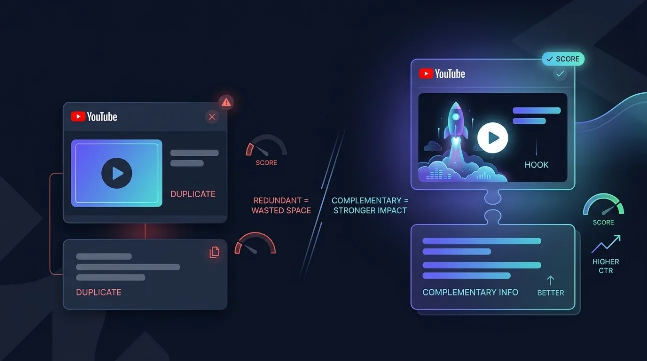
YouTube thumbnails should not repeat the title word-for-word — instead, they should visually complement it by illustrating the core concept, emotion, or outcome the title promises. Repeating text creates redundancy, wastes visual real estate, and reduces the combined impact of both elements. A strong thumbnail-title pairing uses each to fill the other’s gaps: the thumbnail grabs attention with imagery, and the title provides context or urgency.
When thumbnails and titles work together, they form a unified message that’s easier for viewers to process quickly. Viewers scrolling through YouTube don’t read every word — they scan thumbnails and titles as a single unit. If the two clash or overlap too much, the message becomes muddy. The goal is to create a cohesive visual-textual package that answers “What’s in it for me?” before the viewer even clicks.
Consider this: if your thumbnail already shows a person holding a trophy with “WINNER!” text, and your title reads “I Won $10,000 — Here’s How,” you’re doubling up on the same idea. Instead, the thumbnail could show the trophy with a surprised expression, and the title could say “I Didn’t Expect to Win — Here’s What Happened.” Now, the thumbnail shows the result, and the title adds the twist — together, they create curiosity.
Thumbnail-Title Coherence: Why It Matters for Clarity and Curiosity
Thumbnail-title coherence means the visual and textual elements work together to communicate a single, clear idea without redundancy. When they’re aligned, viewers instantly understand the video’s value — which reduces bounce rates and increases watch time. When they’re mismatched, viewers feel misled, which damages trust and hurts long-term channel growth.
Clarity comes from consistency: if your thumbnail shows a cooking scene and your title says “How to Fix Your Car,” viewers will skip it — not because the content is bad, but because the pairing is confusing. Curiosity, on the other hand, is sparked when the thumbnail hints at a payoff the title promises but doesn’t fully reveal. For example, a thumbnail showing a person staring at a broken phone with a shocked expression, paired with the title “I Fixed My iPhone for $5 — Here’s How,” creates intrigue without giving away the solution.
Think of the thumbnail as the “hook” and the title as the “promise.” The hook grabs attention with emotion or visual contrast, and the promise explains what the viewer will gain. If both say the same thing, you’ve wasted half your message. If they contradict, you’ve broken trust. The sweet spot is when they’re different but related — like two pieces of a puzzle that only make sense when viewed together.
Repeat vs. Complement vs. Avoid: A Comparison Table
| Approach | When to Use | Effect on Viewer | Best For |
|---|---|---|---|
| Repeat | Never — avoid verbatim text duplication | Redundant, cluttered, wastes visual space | None — always replace with complement |
| Complement | Always — thumbnail visualizes the idea, title explains the value | Clear, intriguing, builds trust and curiosity | Most videos — especially tutorials, reviews, and storytelling |
| Avoid | When thumbnail and title contradict or confuse | Confusing, misleading, reduces CTR and retention | Never — always fix mismatches before publishing |
Use this table as a quick reference when reviewing your thumbnail-title pairs. If your thumbnail repeats the title, you’re in the “Repeat” column — fix it. If they’re mismatched, you’re in “Avoid” — realign them. The only column you want to be in is “Complement,” where each element adds something the other lacks.
Three Concrete Thumbnail-and-Title Pairs That Work
Here are three real-world examples of thumbnail-title pairings that demonstrate complementarity, not repetition. Each uses the thumbnail to show the “what” and the title to explain the “why” or “how.”
Example 1: Tech Tutorial
Thumbnail: A person holding a smartphone with a cracked screen, looking frustrated, with a bright red “FIXED” sticker on the corner.
Title: “I Fixed My Cracked Phone Screen in 10 Minutes — No Tools Needed”
This pairing works because the thumbnail shows the problem (cracked screen) and the solution (fixed), while the title adds the benefit (fast, no tools). The viewer instantly understands the payoff without reading every word.
Example 2: Gaming Video
Thumbnail: A character in a game mid-air, about to land on a hidden trap, with a glowing “DANGER” sign in the background.
Title: “I Found the Secret Trap in This Game — Here’s How to Avoid It”
Here, the thumbnail creates tension (the trap), and the title offers relief (how to avoid it). The viewer is drawn in by the visual drama and stays for the practical solution.
Example 3: Lifestyle Vlog
Thumbnail: A person standing in front of a cluttered closet, hands on hips, with a “BEFORE” label in the corner.
Title: “I Organized My Closet in One Day — Here’s My Simple System”
The thumbnail shows the starting point (clutter), and the title promises the transformation (organized, simple system). The viewer sees the problem and is curious about the solution — a classic hook-and-promise combo.
Checklist for Splitting Information Between Thumbnail and Title
Use this checklist to ensure your thumbnail and title complement each other without overlap. Go through each item before publishing — it takes less than a minute but can significantly improve your click-through rate.
- Does the thumbnail show the core visual idea (e.g., a person, object, or emotion) without repeating the title text?
- Does the title explain the benefit, outcome, or method without duplicating what’s already obvious in the thumbnail?
- Is there a clear “hook” in the thumbnail and a “promise” in the title that together answer “What’s in it for me?”
- Would a viewer understand the video’s value if they only saw the thumbnail? If not, add context to the title.
- Would a viewer understand the video’s value if they only read the title? If not, add visual cues to the thumbnail.
- Is there any contradiction between the two? If yes, revise until they align.
Applying this checklist consistently will help you avoid the most common thumbnail-title mistakes. It’s not about making them identical — it’s about making them work as a team. For a deeper dive into how these elements affect your overall score, check out our guide to YouTube’s 12 scoring factors.
How to Test Your Thumbnail-Title Pair for Maximum Impact
Testing your thumbnail-title pair is essential — what looks balanced on your screen may not read clearly at thumbnail size. Start by viewing your thumbnail and title together on a small screen, like a phone or tablet. If you can’t instantly grasp the video’s value, you need to simplify or clarify.
Ask yourself: Does the thumbnail grab attention? Does the title explain why the viewer should care? If the answer to either is no, revise. You can also use tools like ThumbSignal’s free thumbnail and title analyzer to get instant feedback on how your pairing performs against YouTube’s best practices. It evaluates clarity, curiosity, and coherence — three key factors that influence click-through rates.
Another effective method is to show your thumbnail-title pair to someone unfamiliar with your content. Ask them to describe what they think the video is about based on the thumbnail and title alone. If their description matches your intent, you’re on the right track. If not, adjust until it does. Real viewer feedback is the best way to ensure your message lands.
Related reading
- What Makes a Good YouTube Thumbnail: 12 Factors That Drive Clicks
- How to Increase YouTube CTR Without Clickbait Tactics
Frequently Asked Questions
Should I ever repeat the title in the thumbnail?
No — repeating the title verbatim in the thumbnail wastes visual space and creates redundancy. Instead, use the thumbnail to visualize the core idea or emotion, and let the title explain the benefit or method. The two should complement, not duplicate, each other.
What happens if my thumbnail and title don’t match?
If your thumbnail and title mismatch, viewers may feel misled, which can hurt your click-through rate and retention. YouTube’s system may also penalize videos that appear deceptive, so always ensure your thumbnail accurately reflects the content your title promises.
How can I make my thumbnail and title more cohesive?
Use a checklist to split information: thumbnail shows the “what,” title explains the “why” or “how.” Test your pair on a small screen to ensure clarity, and ask real viewers for feedback. Tools like ThumbSignal’s analyzer can also help you spot mismatches before publishing.
Can a good thumbnail make up for a weak title?
Not reliably. While a strong thumbnail can grab attention, a weak title won’t convince viewers to click. The two work as a team — if one is weak, the other can’t fully compensate. Always optimize both for clarity, curiosity, and coherence.
Is it better to prioritize curiosity or clarity in the thumbnail-title pair?
Balance both. Curiosity draws the click, but clarity keeps the viewer watching. A thumbnail that’s too mysterious may not get clicks, and one that’s too obvious may not spark interest. Aim for a pairing that’s clear enough to understand and intriguing enough to click.