Key takeaways
- Thumbnail visibility depends more on luminance contrast than color saturation — test by squinting or converting to grayscale.
- Always preview thumbnails against both light-mode and dark-mode feed backgrounds to ensure legibility in all viewing conditions.
- Over-saturating every element reduces contrast — strategic use of brightness and darkness creates visual hierarchy.
- No single color guarantees higher CTR; choose colors that improve readability and fit your niche’s visual language.
- Run your final thumbnail through a contrast analyzer before publishing to catch hidden visibility issues.
Why Your YouTube Thumbnail Disappears in the Feed
YouTube thumbnails vanish in the feed when they lack sufficient contrast against the background — not because they’re poorly designed, but because they fail the basic test of visual separation. The most common culprit is confusing color vibrancy with contrast. A thumbnail can be full of bright colors and still blend into the feed if its luminance values are too similar to the surrounding UI. This happens most often in dark mode, where low-contrast elements get swallowed by the background.
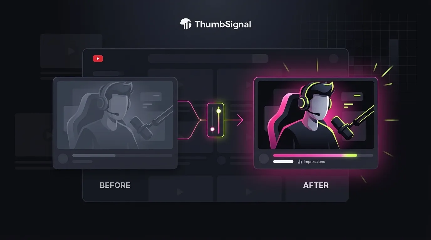
Contrast isn’t just about color — it’s about brightness. A thumbnail with high luminance contrast will stand out even if it’s in grayscale. That’s why you should test every thumbnail by squinting at it or converting it to black and white. If the key elements (face, text, object) still pop, you’ve got good contrast. If they blur together, you need to adjust the brightness levels, not just the hue.
YouTube’s feed is dynamic — viewers switch between light and dark mode, and thumbnails appear next to videos with wildly different color palettes. A thumbnail that looks bold against a white background might look washed out next to a dark video. That’s why you must check your thumbnail against both modes. Use YouTube’s preview tools or a simple screenshot of the feed in both modes to simulate real-world visibility.
YouTube Thumbnail Colors: What Actually Works in the Feed
There’s no magic color that guarantees clicks — what matters is how that color interacts with the rest of the thumbnail and the feed background. Bright reds, yellows, and oranges tend to draw attention, but only if they contrast sharply with the surrounding elements. A saturated red background with white text can work, but if the subject’s skin tone is also warm, the text may not stand out. The goal is readability, not saturation.
Color choices should serve your niche. Gaming thumbnails often use high-contrast neon palettes, while educational channels benefit from clean, muted tones with bold accent colors. A cooking channel might use warm yellows and reds to evoke food, but if every element is saturated, nothing stands out. The trick is to use one or two saturated colors as accents, and keep the rest of the thumbnail in mid-tones or neutrals to create visual hierarchy.
Never assume a color will work because it’s “popular.” Test it. Upload a draft thumbnail and view it in the feed next to videos from your niche. If it doesn’t stand out, adjust the brightness or swap the background color. Remember: color is a tool for emphasis, not decoration. Use it to guide the viewer’s eye to the most important element — usually the face, text, or key object.
Thumbnail Contrast: The Squint Test and Grayscale Check
Contrast comes in two forms: color contrast and luminance contrast. Color contrast is the difference in hue — red vs. blue, for example. Luminance contrast is the difference in brightness — white vs. black, or light gray vs. dark gray. YouTube thumbnails live or die by luminance contrast because it’s what the eye detects first, especially in a fast-scrolling feed.
Here’s how to test it in ten seconds: squint at your thumbnail. If the key elements (face, text, object) still stand out, you have good luminance contrast. If they blur together, you need to adjust the brightness levels. Alternatively, convert the thumbnail to grayscale. If the text or subject is hard to read, the luminance contrast is too low. This test reveals why some thumbnails look great in color but disappear in the feed — they rely on color contrast alone, which fails when the eye is scanning quickly.
Many creators make the mistake of boosting saturation across the entire thumbnail, thinking it will make it “pop.” In reality, this reduces contrast because everything becomes equally bright. A thumbnail with a dark background, medium-toned subject, and bright text will have higher contrast than one where everything is maxed out. Use saturation sparingly — as an accent, not a default.
YouTube Thumbnail Dark Mode: Why It’s Not Optional
Dark mode isn’t a niche preference — it’s a standard viewing mode for millions of YouTube users. If your thumbnail looks great in light mode but vanishes in dark mode, you’re losing potential clicks. The problem isn’t the mode itself — it’s that dark mode changes the background from white to near-black, which can swallow low-contrast elements.
To test your thumbnail in dark mode, switch your YouTube app or browser to dark mode and scroll through the feed. Look for thumbnails that blend into the background — they’re the ones with low luminance contrast. If your thumbnail is dark with dark text, it will disappear. If it’s light with light text, it will look washed out. The solution is to ensure your thumbnail has a clear brightness hierarchy: dark background with light text, or light background with dark text.
Some creators design two versions of their thumbnail — one for light mode, one for dark mode. That’s overkill. Instead, design for maximum luminance contrast and test it in both modes. A thumbnail that works in dark mode will almost always work in light mode, but the reverse isn’t true. Prioritize dark mode testing — it’s the stricter test of visibility.
Best Colors for YouTube Thumbnails: A Niche-by-Niche Guide
There’s no universal “best color” for YouTube thumbnails — what works depends on your niche, audience, and content type. A gaming channel might use neon greens and purples to match the aesthetic of its games, while a finance channel might use blues and grays to convey trust. The key is to choose colors that improve readability and fit your brand, not to chase trends.
Here’s a quick guide by niche:
- Gaming: High-contrast neon palettes (bright green, electric blue) with dark backgrounds to make text pop.
- Educational: Clean, muted tones (soft grays, beiges) with bold accent colors (red, orange) for titles or icons.
- Beauty: Warm tones (pinks, golds) with high-contrast text (white or black) to highlight products or faces.
- Finance: Cool tones (blues, grays) with high-contrast text (white or yellow) for clarity and professionalism.
Remember: color is a tool for emphasis, not decoration. Use it to guide the viewer’s eye to the most important element — usually the face, text, or key object. Don’t saturate everything — that reduces contrast. Instead, use one or two saturated colors as accents, and keep the rest of the thumbnail in mid-tones or neutrals to create visual hierarchy.
How to Fix a Thumbnail That Disappears in the Feed
Fixing a disappearing thumbnail is a matter of adjusting contrast, not redesigning from scratch. Start by identifying the problem: is it low luminance contrast, poor color choice, or a dark-mode issue? Once you know the cause, apply these steps to fix it.
- Squint at your thumbnail or convert it to grayscale. If key elements don’t stand out, adjust the brightness levels — make the background darker or lighter, and the text or subject brighter or darker.
- Test the thumbnail in both light and dark mode. If it disappears in dark mode, increase the luminance contrast — use a dark background with light text, or vice versa.
- Reduce saturation across the entire thumbnail. Use saturation sparingly — as an accent, not a default. A thumbnail with a dark background, medium-toned subject, and bright text will have higher contrast than one where everything is maxed out.
- Choose colors that improve readability and fit your niche. Don’t chase trends — test colors against your thumbnail’s background and the feed background.
- Run your final thumbnail through a contrast analyzer to catch hidden visibility issues. Use our free thumbnail analyzer to test luminance contrast and color balance before publishing.
These steps will fix most visibility issues. If your thumbnail still disappears, revisit the luminance contrast — that’s usually the root cause. Remember: contrast is about brightness, not color. A thumbnail that works in grayscale will work in color.
Pre-Publish Thumbnail Checklist: Avoid Disappearing Thumbnails
Before you hit publish, run your thumbnail through this checklist to ensure it won’t disappear in the feed. This isn’t about aesthetics — it’s about visibility. A thumbnail that doesn’t stand out won’t get clicks, no matter how creative it is.
- ✅ Squint test: Can you still see the key elements (face, text, object) when you squint?
- ✅ Grayscale test: Does the thumbnail still have clear contrast when converted to black and white?
- ✅ Dark mode test: Does the thumbnail stand out against a dark background?
- ✅ Saturation check: Is saturation used sparingly, as an accent, not a default?
- ✅ Niche fit: Do the colors match your niche’s visual language and improve readability?
- ✅ Contrast analyzer: Did you run the thumbnail through a contrast analyzer to catch hidden issues?
If you check all these boxes, your thumbnail will stand out in the feed — in both light and dark mode. If not, go back and adjust the luminance contrast. That’s the single most important factor for visibility.
Related reading
- YouTube Thumbnail Text: How Many Words Actually Work Best
- What Top YouTube Thumbnails Have in Common: 100 Real Examples
Frequently Asked Questions
Does dark mode affect YouTube thumbnail visibility?
Yes, dark mode changes the feed background from white to near-black, which can swallow low-contrast thumbnails. Always test your thumbnail in both light and dark mode to ensure it stands out in all viewing conditions.
What’s the difference between color contrast and luminance contrast?
Color contrast is the difference in hue (red vs. blue), while luminance contrast is the difference in brightness (white vs. black). Thumbnails live or die by luminance contrast because it’s what the eye detects first in a fast-scrolling feed.
Should I use saturated colors in my YouTube thumbnail?
Use saturated colors sparingly — as accents, not a default. Over-saturating every element reduces contrast because nothing stands apart. A thumbnail with strategic saturation and strong luminance contrast will perform better than one that’s uniformly bright.
Is there a best color for YouTube thumbnails?
No single color guarantees higher CTR. Choose colors that improve readability and fit your niche’s visual language. Test colors against your thumbnail’s background and the feed background to ensure they stand out.
How can I test my thumbnail before publishing?
Use the squint test, grayscale test, and dark mode test to check contrast. Then, run your thumbnail through a contrast analyzer to catch hidden visibility issues. Our free thumbnail analyzer can help you test luminance contrast and color balance before publishing.