Key takeaways
- YouTube thumbnails should be 1280x720 pixels at 16:9 aspect ratio to avoid scaling issues.
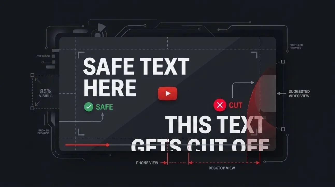
- Text and faces must stay within the center 80% of the thumbnail to remain visible across all devices.
- Mobile feeds crop the bottom 15–20% and add a duration badge and progress bar that obscure corners.
- Desktop and TV surfaces display more of the thumbnail, but still crop edges differently than the full preview.
- Always preview your thumbnail at feed size to verify critical elements aren’t hidden or overlaid.
YouTube thumbnail size and dimensions: What you must use
YouTube requires thumbnails to be 1280x720 pixels at a 16:9 aspect ratio. This resolution ensures your thumbnail displays sharply on all devices without being stretched or pixelated. While YouTube accepts uploads up to 2MB, sticking to 1280x720 prevents automatic downscaling that can blur text or details. Always design at this exact size — not 1920x1080 or 1080x1080 — to avoid unintended cropping or compression artifacts.
Older guides sometimes cite 1920x1080 or 1080x1080 as acceptable, but YouTube’s current documentation confirms 1280x720 as the standard. Uploading higher resolutions doesn’t improve quality — it just risks the platform scaling down your image, which can soften edges and reduce text legibility.
Use this resolution consistently across all your videos. Even if you’re designing for a specific device, the 1280x720 base ensures compatibility with YouTube’s adaptive display system, which resizes thumbnails based on context — feed, search, browse, or channel page.
Where YouTube overlays badges and progress bars on thumbnails
YouTube adds two persistent overlays to thumbnails: a duration badge in the bottom-right corner and a watched-progress bar along the bottom edge. These elements cover parts of your image and can hide text or faces if placed too close to the edges. The duration badge typically occupies the bottom-right 10–15% of the thumbnail, while the progress bar spans the full width of the bottom 5–8%.
On mobile feeds, these overlays are more intrusive. The duration badge is larger and the progress bar thicker, often obscuring the bottom 15–20% of the thumbnail. On desktop, the overlays are smaller but still cover critical areas. Never place important text or faces in the bottom-right quadrant — it’s the most likely area to be hidden.
These overlays are not optional — they appear on every thumbnail in feeds and search results. Designing around them isn’t a workaround; it’s a requirement. Treat the bottom 20% of your thumbnail as a no-go zone for critical content.
How YouTube crops and scales thumbnails across different surfaces
YouTube doesn’t display thumbnails uniformly — it crops and scales them differently depending on where they appear. In the mobile feed, thumbnails are cropped to a 1:1 square, hiding the top and bottom 20–25%. On desktop, the feed shows a wider 16:9 crop, but still trims the top and bottom slightly. On TV, thumbnails are displayed at full 16:9 but scaled down, which can make small text illegible.
The search results page uses a different crop than the browse page, and the channel page thumbnail is often displayed at a smaller size with more aggressive edge cropping. Even the “recommended videos” sidebar on desktop uses a tighter crop than the main feed. This inconsistency means a thumbnail that looks perfect in preview may be partially hidden in actual use.
To test this, upload a test thumbnail and view it across all surfaces: mobile feed, desktop feed, search results, and channel page. You’ll see how much of your image is hidden in each context. Design for the most restrictive surface — usually the mobile feed — to ensure your thumbnail remains effective everywhere.
Thumbnail safe zone rule: Where to place text and faces
Place all critical text and faces within the center 80% of your thumbnail to ensure they remain visible across all devices and surfaces. This safe zone avoids the top and bottom 10% and the left and right 10%, which are most likely to be cropped or overlaid. For a 1280x720 thumbnail, this means keeping text and faces within the 1024x576 center rectangle.
This rule applies to both text and faces. Faces placed too close to the edge may be cut off in mobile feeds, and text near the bottom may be hidden by the duration badge or progress bar. Use this safe zone as a guide — not a suggestion — to ensure your thumbnail communicates clearly regardless of where it’s viewed.
Many creators make the mistake of designing for the full 1280x720 preview, forgetting that viewers rarely see the entire image. Always design for the cropped view, not the full preview. If your thumbnail looks good at feed size, it will look good everywhere.
See the problem: Same thumbnail at feed size
Viewing your thumbnail at feed size reveals how much of it is hidden in actual use. On mobile, the feed crops the thumbnail to a 1:1 square, hiding the top and bottom 25%. On desktop, the feed shows a wider crop but still trims the top and bottom 10–15%. This means a thumbnail that looks balanced in preview may appear unbalanced or incomplete in the feed.
To illustrate this, imagine a thumbnail with a face centered at the top. In preview, it looks fine — but in the mobile feed, the top 25% is cropped, cutting off the face. Similarly, text placed at the bottom may be hidden by the duration badge or progress bar. Always preview your thumbnail at feed size to verify critical elements aren’t hidden.
Use YouTube’s own preview tool or a third-party thumbnail checker to simulate how your thumbnail will look in different contexts. If you can’t see the entire face or read the text in the feed preview, adjust your design. This step is non-negotiable — it’s the difference between a thumbnail that grabs attention and one that gets ignored.
Verify against YouTube’s current documentation
YouTube’s thumbnail specifications have changed over time, so always verify against the current documentation rather than relying on older guides. As of 2024, YouTube officially recommends 1280x720 pixels at 16:9 aspect ratio, with a maximum file size of 2MB. The platform no longer accepts 1920x1080 or 1080x1080 as primary resolutions — these are scaled down, which can reduce quality.
YouTube’s documentation also confirms that thumbnails are cropped differently across surfaces, with mobile feeds being the most restrictive. The duration badge and progress bar are mandatory overlays that cover the bottom-right corner and bottom edge, respectively. These details are not optional — they’re part of the platform’s design and must be accounted for in your thumbnail layout.
Don’t trust outdated blog posts or forum threads — they may reflect old specifications that no longer apply. Always check YouTube’s official help center for the latest guidelines. This ensures your thumbnails meet current standards and perform well across all surfaces.
How to test your thumbnail before publishing
Before publishing, test your thumbnail across all surfaces to ensure it looks good everywhere. Use YouTube’s preview tool or a third-party thumbnail checker to simulate how your thumbnail will appear in mobile feeds, desktop feeds, search results, and channel pages. Pay special attention to the bottom-right corner — this is where the duration badge and progress bar will cover your image.
Also, test your thumbnail at different resolutions. View it on a phone, tablet, and desktop to see how it scales and crops. If text becomes illegible or faces are cut off, adjust your design. Remember, your thumbnail must communicate clearly at feed size — not just in preview.
For a quick test, upload a draft video and view the thumbnail in the mobile app. If you can’t read the text or see the face clearly, redesign it. This step takes only a few minutes but can significantly improve your thumbnail’s effectiveness. You can also use our free thumbnail analysis tool to check your design against YouTube’s current specifications and get instant feedback on safe zones and text placement.
Related reading
- What Makes a Good YouTube Thumbnail: 12 Factors That Drive Clicks
- Should YouTube Thumbnails Repeat Titles? The Right Way to Combine Them
Frequently Asked Questions
What is the recommended YouTube thumbnail size?
YouTube recommends 1280x720 pixels at a 16:9 aspect ratio. This resolution ensures your thumbnail displays sharply on all devices without being stretched or pixelated. Avoid using higher resolutions like 1920x1080, as YouTube will scale them down, which can reduce quality.
Where should I place text in a YouTube thumbnail?
Place all critical text within the center 80% of your thumbnail — the 1024x576 rectangle in a 1280x720 image. Avoid the bottom 20% to prevent text from being hidden by the duration badge or progress bar, and avoid the top 10% to prevent cropping in mobile feeds.
Why does my thumbnail look different in the feed than in preview?
YouTube crops and scales thumbnails differently depending on where they appear. Mobile feeds crop to a 1:1 square, hiding the top and bottom 25%, while desktop feeds show a wider 16:9 crop but still trim the top and bottom 10–15%. Always preview your thumbnail at feed size to verify critical elements aren’t hidden.
Do I need to design different thumbnails for mobile and desktop?
No — design one thumbnail that works across all surfaces. Use the center 80% safe zone for critical content, and avoid placing text or faces near the edges. This ensures your thumbnail looks good everywhere, regardless of device or context.
How do I test my thumbnail before publishing?
Upload a draft video and view the thumbnail in the mobile app, desktop feed, and search results. Use YouTube’s preview tool or a third-party thumbnail checker to simulate different surfaces. If text is illegible or faces are cut off, adjust your design. You can also use our free thumbnail analysis tool for instant feedback.