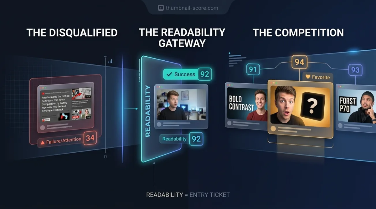
Most thumbnail advice starts with readability: big text, high contrast, one focal point. That advice is right, and it is also where established channels already are. Across 642 real thumbnails, our readability score barely moved, and deleting it from the overall score did not change how well the score ranked real videos at all.
Key takeaways
- Across 642 thumbnails from established channels, our readability sub-score ran only from 85 to 95. Every other factor we measure varied more.
- Removing readability from the score entirely left its ranking accuracy exactly where it was: 62.0% of 321 same-channel pairs.
- Readability still matters as a floor. A thumbnail nobody can read at phone size fails before anything else is judged — it just stopped separating good videos from great ones.
- We reduced its weight in the score substantially, but not to zero, because the sample contained no beginners.
- Once the text is legible, the title and the clarity of the promise are where the remaining differences were.
Does thumbnail readability affect which videos perform better?
Readability decides whether a thumbnail is in the game, not whether it wins. Among established channels, our model rated almost every thumbnail as easy to read, so readability could not tell a channel's hits from its misses. When we deleted it from our score, the score ranked real videos exactly as well as before: 62.0% of 321 pairs.
That is a narrower claim than it sounds, and the narrowness matters. It does not say readability is unimportant. It says that among channels that have been uploading long enough to have a baseline, the readability problem has already been solved, and a factor that everyone passes cannot rank anyone.
How much readability actually varies between real thumbnails
Every thumbnail in the study was scored on twelve factors. Here is how widely six of them ranged across all 642 thumbnails — the same 321 pairs used in our published test of the score. The spread column is the standard deviation: roughly, how far a typical thumbnail sat from the average.
| Factor | Lowest to highest score | Spread |
|---|---|---|
| Readability | 85 to 95 | 3.7 |
| Clickbait risk | 3 to 44 | 5.4 |
| Curiosity | 29 to 68 | 6.8 |
| Title strength | 23 to 93 | 10.3 |
| Promise clarity | 8 to 95 | 13.9 |
| Cliffhanger | 17 to 93 | 14.9 |
Readability is not merely the narrowest column. Its entire range, lowest to highest, is smaller than the typical distance from average of the factors at the bottom of the table. The weakest thumbnail in the whole sample still scored 85.
These are our model's ratings, not measurements taken with a ruler. But the model was not being lenient in general: it spread promise clarity across almost the whole scale, from 8 to 95. It had the range available and did not use it for readability, because the thumbnails in front of it did not differ much on that.
What a narrow range does to a score
A weight in a score does not measure how important something is. It decides how much the final number moves when that factor changes. If a factor barely changes, a large weight on it mostly adds the same amount to every thumbnail. It lifts everyone's score without separating anyone.
Readability carried one of the largest weights on the click side of our score while varying less than anything else we measure. In practice it worked as a near-constant bonus, and a constant bonus compresses exactly the differences between thumbnails that the rest of the score exists to show.
What happened when we removed readability from the score
We did not have to guess. The study already holds every sub-score for every thumbnail, so the overall score can be recomputed under any set of weights without asking the model anything new. We ranked all 321 pairs again with readability at its original weight, at several reduced weights, and at zero, comparing scores at full precision rather than as rounded whole numbers — which is why these figures sit slightly above the 59.5% we published originally.
At its original weight, the score picked the better-performing video in 62.0% of pairs. At zero, with readability deleted outright, it picked the better one in 62.0% of pairs. Every value in between stayed within 0.6 points of that. On the half of the channels that none of our prompt experiments touched, the result held: 59.4% at the original weight, and 59.4% at zero.
Why we reduced it instead of removing it
The data would have allowed deleting readability entirely. We did not, because of who was in the sample. Every channel in the study was established: long upload histories, stable audiences, thumbnails made by people who had long since learned to make text legible. That is exactly why readability looked inert.
It is not who uses a thumbnail checker. A creator uploading their tenth video with a tiny caption across a busy background is the person readability exists to catch, and for them it varies a great deal. Removing it on the strength of a sample containing no such thumbnails would be answering a question the data never asked. So its weight was cut substantially, and the difference was shared across the other click factors in proportion to their existing weights, which leaves their order unchanged.
For a typical thumbnail the overall score falls by about one point. We also tested a full statistical re-weighting of all twelve factors; it gained 1.9 points, which is inside the noise for a sample this size, so the rest of the weights were left as they were.
The readability bar every thumbnail has to clear
None of this means readability can be skipped. It means it is a pass-or-fail check to clear quickly, and then stop polishing. A workable version of that check:
- Shrink the thumbnail to roughly the size it appears in a list of suggested videos and look at it for one second. If you cannot read every word, there are too many words or they are too small.
- Count the words on the image. Three or four is already a lot at that size, and one short phrase usually reads better than a sentence.
- Check the contrast in greyscale. Text that stands out from its background only by colour disappears for some viewers and on some screens.
- Find the single thing the eye lands on first. If two focal points compete, the thumbnail asks the viewer to choose before they have decided to click.
- Look at it beside the thumbnails it will actually appear next to. Legible on a blank canvas is not the same as legible in a crowded feed.
If a thumbnail passes all five, more work on readability is unlikely to be what separates it from the video beside it.
Where to spend effort once the text is legible
In our original test, the factor that most clearly separated a channel's over-performers from its under-performers was promise clarity: how unambiguously the packaging says what the video is. The fear-of-missing-out signal and urgency came next. All three live mostly in the title, and in how the title and image work together, rather than in the legibility of the lettering.
That fits the one experiment in the study that changed the title while keeping the image. When every thumbnail was re-scored against the other video's title, its score moved by more than eleven points on average — about three times readability's entire spread. In our model's view, the words carry more of the difference than the lettering does. If you want to see where your own packaging sits, you can score a thumbnail and title against the same twelve factors and see which ones are holding it back.
Limits of this finding
Everything here describes established, English-language channels, scored by one model. Readability looked inert because those channels had already solved it, and the finding should not be carried over to a new channel without that caveat attached.
The readability figures are the model's ratings rather than an independent measurement, so a model that systematically overrated legibility would produce the same narrow range. We think that unlikely, since the same model used nearly the whole scale for other factors, but this data alone cannot rule it out. And as with the original study, all of this is association: no thumbnail was changed and re-published to see what happened next.
Frequently asked questions
Does thumbnail text size matter on YouTube?
Yes, as a floor. Text that cannot be read at the size a thumbnail appears in a feed wastes the space it occupies. What our data suggests is that established channels have almost all cleared that floor already, so once text is legible, making it bigger or bolder is unlikely to be what separates one video from another.
Why did readability stop mattering in your score?
It did not stop mattering; it stopped separating. Across 642 thumbnails from established channels it ranged only from 85 to 95, so it added nearly the same amount to every score. Removing it left the score's ability to rank real videos unchanged, which is why its weight was reduced.
Should I stop working on thumbnail readability?
Only once it passes a quick check at feed size: every word readable in about a second, one clear focal point, and enough contrast to survive greyscale. Beyond that point, time spent on the title and on how clearly the packaging states its promise is more likely to change how the video compares with its neighbours.
Did this change my existing thumbnail scores?
Slightly. With readability's weight reduced and the other click factors raised to compensate, a typical overall score falls by about one point. Across the reference thumbnails we check every change against, no grade changed and the largest move was a single point.
Does this apply to small or new channels?
Not automatically. Every channel in the sample was established, which is exactly why readability showed so little variation. A newer channel is far more likely to have genuinely hard-to-read thumbnails, and for those, readability can be the most important thing to fix first.