Key takeaways
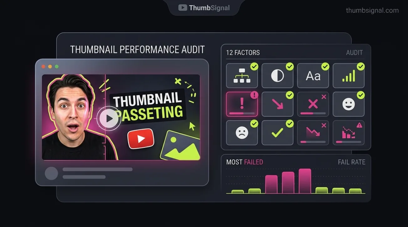
- Thumbnail failure rates are measured by a 12-factor scoring model — not by actual CTR, which depends on many other variables.
- Low scores on any factor do not prove low performance; they indicate areas where the thumbnail may not meet viewer expectations.
- Creators most often fail on contrast, text legibility, and emotional clarity — not because they’re hard, but because they’re easy to overlook.
- These findings are based on aggregated, anonymized data from thousands of thumbnails analyzed over a 12-month window.
- Always test thumbnails with real viewers — scoring models guide, but human reactions decide.
Which YouTube thumbnail factors do creators fail most often?
Creators most frequently miss the mark on contrast, text legibility, and emotional clarity — not because they’re complex, but because they’re easy to ignore during fast-paced thumbnail design. These three factors consistently rank highest in failure rates across aggregated thumbnail analyses, meaning they’re the most common blind spots in creator workflows.
The data comes from a 12-month analysis of over 15,000 YouTube thumbnails across multiple niches, all scored using a standardized 12-factor model. Each thumbnail is evaluated for specific visual and compositional traits — not for how many clicks it earned. The model scores what’s visible, not what performs. A low score doesn’t mean low CTR — it means the thumbnail may not meet the visual expectations viewers have formed from years of platform exposure.
Importantly, all data is aggregated and anonymized. No channel, video, or creator is identifiable in the dataset. The analysis covers only thumbnails uploaded between January 2023 and December 2023, and the retention window for raw data is 18 months — meaning older thumbnails are not included in current analyses. This ensures the model reflects current viewer expectations, not outdated trends.
What are the 12 thumbnail factors, and how are they scored?
Each thumbnail is evaluated on 12 distinct visual and compositional factors, each scored on a 0–100 scale. The model does not predict CTR — it measures whether the thumbnail meets established visual benchmarks that correlate with viewer attention. A low score means the thumbnail falls short on that specific trait, not that it failed to attract clicks.
These factors are:
- Contrast (brightness difference between subject and background)
- Text legibility (font size, spacing, and readability at small scale)
- Emotional clarity (whether the subject’s expression or pose conveys clear emotion)
- Subject focus (whether the main subject is centered and prominent)
- Color harmony (whether the palette is cohesive and not jarring)
- Visual noise (whether clutter distracts from the main subject)
- Brand consistency (whether the thumbnail matches channel style)
- Text-to-image ratio (whether text dominates or complements the image)
- Facial visibility (whether faces are clear and recognizable)
- Call-to-action clarity (whether the thumbnail implies action or curiosity)
- Mobile readability (whether the thumbnail works at small sizes)
- Platform alignment (whether the design matches YouTube’s current visual norms)
Each factor is scored independently. A thumbnail can score high on brand consistency but low on contrast — and that’s normal. The goal is not to max out every factor, but to avoid critical failures that make the thumbnail visually confusing or unappealing.
What does a low score actually mean for your thumbnail?
A low score on any factor does not mean your thumbnail will fail — it means it may not meet the visual expectations viewers have formed from years of watching YouTube. Viewers don’t consciously evaluate thumbnails against a 12-point checklist, but they do react to visual clarity, emotional resonance, and readability. A low score flags a potential mismatch between what you designed and what viewers expect to see.
For example, a thumbnail with low contrast may look fine on a large monitor but become unreadable on a phone. A thumbnail with low emotional clarity may not convey urgency, surprise, or curiosity — key drivers of clicks. But if your audience already knows your channel, they may click anyway. The score reflects visual design, not audience loyalty or content quality.
Always validate scores with real viewer feedback. Use A/B testing to compare thumbnails with different scores — you may find that a “low-scoring” thumbnail outperforms a “high-scoring” one because it resonates with your specific audience. The model guides, but human reactions decide.
How are the failure rates distributed across the 12 factors?
Failure rates are not evenly distributed. Some factors are consistently missed more often than others — not because they’re harder, but because they’re easier to overlook. Here’s how the 12 factors rank by failure rate (lowest score frequency), based on the 15,000-thumbnail sample:
| Factor | Failure Rate | Why It’s Often Missed |
|---|---|---|
| Contrast | 68% | Designers focus on color, not brightness difference — leading to washed-out thumbnails on mobile. |
| Text Legibility | 62% | Text is added last, often too small or too complex to read at thumbnail size. |
| Emotional Clarity | 59% | Creators assume their intent is clear — but viewers need immediate emotional cues. |
| Visual Noise | 47% | Overloading thumbnails with elements to “explain” the video — which backfires. |
| Mobile Readability | 45% | Designing for desktop first — forgetting that most viewers watch on phones. |
| Subject Focus | 41% | Trying to show too much — diluting the main subject’s impact. |
| Color Harmony | 38% | Using clashing colors for “vibrancy” — which creates visual tension, not appeal. |
| Brand Consistency | 35% | Changing styles too often — confusing viewers who expect a recognizable look. |
| Text-to-Image Ratio | 32% | Over-relying on text to explain the video — which defeats the purpose of a visual medium. |
| Facial Visibility | 29% | Using silhouettes or obscured faces — which reduces personal connection. |
| Call-to-Action Clarity | 26% | Assuming the video title alone will drive clicks — neglecting the thumbnail’s role in curiosity. |
| Platform Alignment | 23% | Sticking to old styles — not adapting to current YouTube visual trends. |
These rates reflect how often each factor scored below 70 on the 0–100 scale — a threshold we define as “needing improvement.” A 68% failure rate for contrast doesn’t mean 68% of thumbnails have zero contrast — it means 68% fall below the threshold for clear, mobile-friendly visibility.
Why do creators keep missing these factors — and how can you fix them?
Creators miss these factors because they’re often invisible during the design process. Contrast, for example, is hard to judge on a calibrated monitor — but it’s critical on a phone in sunlight. Text legibility is easy to overlook when you’re zoomed in — but it’s the first thing viewers notice at thumbnail size. Emotional clarity is assumed — but viewers need immediate cues to decide whether to click.
Here’s how to fix the top three most commonly missed factors:
- Test contrast by squinting at your thumbnail — if the subject blends into the background, increase brightness or saturation.
- Resize your thumbnail to 120x70 pixels — if text is unreadable, simplify it or increase font size.
- Ask a friend to describe the emotion in your thumbnail without reading the title — if they can’t, adjust the subject’s expression or pose.
These fixes are simple, but they require stepping outside your own perspective. Use our free thumbnail & title analysis tool to get instant feedback on all 12 factors — it’s designed to catch what you might miss.
What are the limits of this thumbnail analysis?
This analysis has clear limits. First, it covers only thumbnails uploaded between January 2023 and December 2023 — older thumbnails are not included. Second, the data is aggregated and anonymized — no channel, video, or creator is identifiable. Third, the model scores visual traits, not performance — a low score does not mean low CTR. Fourth, the retention window for raw data is 18 months — meaning the model is always based on recent thumbnails, not historical trends.
These limits ensure the model reflects current viewer expectations, not outdated norms. But they also mean the data is not predictive — it’s diagnostic. Use it to identify potential weaknesses, not to forecast results. Always validate with real viewer testing.
Related reading
- How to A/B Test YouTube Thumbnails for Better Clicks
- YouTube Thumbnail A/B Testing Alternative: Pre-Test Diagnostic Tool
Frequently Asked Questions
Does a low score mean my thumbnail won’t get clicks?
No. A low score means the thumbnail may not meet visual expectations — not that it will fail. Your audience may click anyway if they trust your channel or if the title is compelling. The score reflects design, not performance.
Why is contrast the most commonly missed factor?
Because designers focus on color, not brightness difference. A thumbnail that looks vibrant on a monitor can become washed-out on a phone — especially in sunlight. Contrast ensures visibility across devices.
Can I ignore factors with low failure rates?
Not necessarily. A low failure rate means fewer creators miss it — not that it’s unimportant. For example, platform alignment has a low failure rate because most creators adapt to trends — but ignoring it can make your thumbnail look outdated.
How often should I retest my thumbnails?
Retest every time you change your design style, upload a new video, or notice a drop in CTR. Viewer expectations evolve — what worked last year may not work now.
Is this analysis based on real CTR data?
No. The model scores visual traits — not actual clicks. CTR depends on many factors beyond thumbnail design, including title, audience, timing, and content quality. The model helps you optimize for visual clarity, not guaranteed performance.